Tuesday, 26 April 2011

Evaluation- What have you learned from your audience feedback?'e

Once the video had been finished, the next stage was to gather audience feedback. The reasons behind this were that we could gather constructive criticism and then make the changes to the video where need be. We targeted our target audience specifically, but the decided that it would be a good idea to target other people who weren't in the niche audience so that we could get a mixed opinion from a wider view. I also added the video o the Facebook page, where we gathered a few comments of feedback from viewers. 

The feedback we received was mostly positive with a few negative comments on there, which was highly beneficial because it enabled us to realise the mistakes and make the changes needed. Me ad y team, as a group, could not see these changes and which is why we showed the to other watchers so they can spot the little mistakes which we don't see.

One member of the group made comments which stated that...

“I liked the cuts and transitions used because it was in time with the tempo and the song. I also liked how the narrative was shown quite clearly that he was over his head. I thought that the lip syncing was very good in most cases other than a few scenes.”

From this feedback i can tell that the lip syncing which was used was the main issue so we went back to the video editing machine and corrected the changes so that the video was more plausible. Another member of the audience stated that...

 “There is a part near the end where the lead singer is on the bench on his own and it is irrelevant because it is there for one second and it looks out of place.” 

Again, we looked at the error and made the changes necessary. The majority of the audience noted upon the narrative and complimented us for having such an emotional upsetting narrative, which in result was the message we wanted to put across, that it was a sad and upsetting storyline.
media19.JPG.jpg
media20.JPG.jpg

Evaluation-How did you use new media technologies in the construction research, planning and evaluation stages?

Throughout the process of the project I have used a wide rang of new media technologies. One of the first technologies I used was the Internet. I started to use the Internet from the research stage of the project where i was searching and looking at existing products which were similar o the proposed products i would be creating. To search these i used a variety of search engines, with the main one being google and then finding the correct hyperlink or image which corresponded with my research. These were Google, Yahoo and Bing. Possibly the three main search engines on the world wide web. I decided to use more than one so that i was able to widen my research and look into more depth. I also carried out research into the music videos themselves and the main streamer i used for them was YouTube. I chose YouTube because its the biggest video flash player streamer on the web at the moment. 


Despite looking at video for research reasons, I also looked at the for ideas and inspiration through the use of iconography and conventions. Also any other ideas involving shots and angle types. My team mate created a Facebook web page so that we could all access a social networking site and be able to reach out to our target audience. The Facebook page was also used for us as a group to communicate and also upload any items which we had been working on. 


adobe_photoshop.png.jpg
The main software I used was Adobe Photoshop. The main purpose for this software was to enable the user to create an image and add different effects and also edit any element of the image. I had originally used this software in the past, so learning key skills on the product wasn't applicable, so i could get straight on with doing the task. The brush effect which was used throughout every ancillary product was created in Photoshop and it also kept the products consistent. 


Other software I used was Adobe Premiere Pro. I used this software firstly in editing the music video. Before creating the video I had no experience with the software, which resulted in me spending some time getting to know the system and how it operates. I also used Premiere Pro to create and edit the outakes video for the website.


I also used Blogger.com throughout the whole process from start to finish to keep a diary/log book of what i had done and what progress was made between each task. This process allowed me to add text, sound, video and images to each blog to support my written materials. With pictures supporting this, we also used camera video shooting equipment which assisted us on creating and filming each part of the video. 

Evaluation- In what ways does your media product use, develop or challenge forms and conventions of real media products?

The first part of this evaluation will answer this question whilst referring to my video. The second part will refer to the ancillary products which were created along side the music video. we were given a choice to create a music video or film trailer and we chose a music video. our reason for choosing this was that we thought that our resources would be more eligible and also that we could include more media codes and conventions into a music video than in a film trailer. By establishing all of the codes and conventions for music videos and studying all of the iconography for them, we could make a rock music video. The final genre which was chosen was Rock.


THE MUSIC VIDEO


For our research we looked out for specific details of iconography on existing products. We looked at a range of music videos created by Rock bands and we also looked at similar videos from the genre of Pop because it was closely related to the band we chose which have been stereotyped as a 'Pop Rock kind of band'. We found that some of the conventions had a strong narrative, band shots, close-ups of instruments and use of slow motion. Also throughout the video the range of shots used were vast in terms of changing from shot to shot. The most common shots used in the music videos were mid-shots, long-shots, close-ups, tracking shots, panning shots and a pan and zoom shot. These shots were also added into our video and we tried to get the biggest range of shots possible, but at the same time keep it as consistent as possible. for example every band shot would have the same angle on the shot (a crane shot, which dips down and gets a higher angle on the shot).


media1.JPG.jpg


The screenshot above shows you a picture of the opening clip of our music video. We started off by using a close up of the drummers foot kicking the bass drum. this shot was used and synchronised with the opening beat of the song to give the video a sense of rhythm. 

media2.JPG.jpg
Above is a screenshot taken from a music video by 'The Fray'. Its a close-up shot of the snare drum with the drummers stick in the background at the top. this convention was innovated into our music video, and used in a different concept. the close up shot used above was just a quick 1 second shot which was used to establish the importance of the objects in the shot. 


media3.JPG.jpgmedia4.JPG.jpg


Again here, if you compare the two shots, the one on the right was taken from the fray's music video and the one on the left was taken from our music video. the use of these shots are strictly to establish the importance of the shot and the objects/person in the shot.


We also found that the most common shot used was a mid-shot. Below is a shot which is used in our music video and its of a man sitting on a bench in what looks to be a park. we can tell this by just simply looking at the image and this is the main reason for using these mid-shots, its so that the audience can establish who, what and where they are in the video. we can instantly tell that its a man and we can instantly see where he is. not so much what he's doing though, but that comes through with the Mise-En-Scene of the whole video. The mid-shot is sometimes supported or refereed to otherwise as an establishing shot. 


media5.JPG.jpg


Below, we can see a screenshot from a music video I have researched and found a shot very similar, but used in a completely different way.  


media6.JPG.jpg


This shot here shows, clearly, two people sitting on a bed looking sad. We can tell this by their posture and expressions. What supports this fact is the colour of the shot; the director has used a black and white effect on the clip so that it supports the story line throughout the video. 


Band shots are also a very popular shot used in rock band music videos, and they support the fact that the music being played throughout the video was created by them and not computer generated like hip-hop music for instance. 


media7.JPG.jpg

media8.JPG.jpg
We found that by adding band shots into our video we would be supporting strong codes and conventions for rock music video and it also effects and contributes to the verisimilitude of the video. These shots can tend to move away from the narrative sometimes so we decided to link them to our narrative that that we knew that every shot in the video made an impact on the finished product.     


We used transitions in the editing of our music video to show continuity. We used cross dissolves between most shots to make the video flow a lot smoother. If we used a lot of different transitions then the video will end up being confusing and could possibly distract the audiences attention away from the narrative. 


ANCILLARY TASKS


The two main ancillary tasks i done were creating an 'Im There' poster and also 4 bus banners. each of which containing a different member of the band. to create both of these i used Adobe Photoshop CS3. In the past i had used this software before so it gave me a head start into creating the products. i also done some more research in existing products for my ancillary tasks. The first steps i took into researching these products were on google images. The images below support my research from this.  

ballet-classes-signage.jpg600.jpg download.php.jpg

I came up with a good sketched out plan of what i wanted to create and what colours, font and size i was going to have each element. I also looked into how the house style could be carried on throughout my teams work as well. I then had to proof read each part and the decided whether every component was eye-catching and supported its correct codes and conventions. Below is my final ancillary product of the i'm there poster and also my bus banners. 


Im+There.bmp.jpg


Alex+Img.jpgMatt+Img.jpg


Ben-+Img.jpgKyle+Img.jpg


Wednesday, 23 March 2011

Development: Editing The Video


We are now running up to the last few days of final editing. The editing process should be changing minor details and making it looks as professional as possible. The attractiveness of the video needs to be outstanding, so in order to conquer this we started watching them on higher definition screens so that we can pick out any other elements which we thought needed chaining or editing a bit more. We showed our peers and other groups our video today and held feedback from them, or in other terms constructive criticism. We took on board every aspect which was addressed during the viewings and noted them down so that next time we come to editing, probably tomorrow, we shall make those changes to suit these needs. Also in order to get the best feedback out of the first cut, we decided to show not only our class, but another non-media based audience and who better to show this to than our Target audience. We Target a wide range of audience to see and make clear who our target audience were and held feedback from them to. Feedback will be noted down in the next blog to come.

Planning: Storyboard


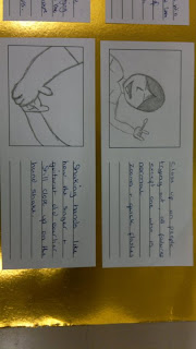
Above are images of our storyboard which was drawn up before the production process. We sat down as a group and each took time to discuss any ideas we had for the project and any ideas for the premise of the music video. Our first initial idea was to base the music video upon a band, but had trouble working around the idea. We then found that basing the music video on a man who had dreams of forming a band and his thoughts upon this was a good starting point a good concept to work from. We then had a story board drawn up and had our main idea. The main storyline for the video was going to be a man who wants to start a bad and looks around the streets for any signs of help forming the band or any musicians. He then comes across musicians and hands them leaflets. They then start joining the band and at the end we find out that his dreams of having a band are all in his head; from the title of the song 'Over my Head'.

Tuesday, 22 March 2011

Development: Final Rough Edit

Our music video has just gone through the stages of its final rough edit. We spent a few hours looking through the video and making notes on what we thought cold be better or could change. We then gathered the notes, went through again and changed them and made the final rough edit of the video. We found that our main problem was transaction between the live band shots and the narrative shots. They didn't have the best transition and didn't look as attractive as they could have been. We tried a few different transactions such as gradient dissolve, which worked at first but we had to incorporate this style into a number of shots throughout the video to keep it consistent. Our plan was to incorporate a different transition apart from cross-dissolve because it had been used before, but we ended up adding some more because of it looking consistent throughout and having the greater impact on the video. The deadline for the video is the end of this week and throughout the week we will keep looking over the video as well as the marking criteria and see whether it fits the specifications and needs and see whether we can change the video to fit these needs.

Monday, 21 March 2011

Planning: House Style & Design

The initial colours chosen at first were going to be Black, White and Gold. these three colours contrasted very well together and fitted in with other similar products. the graphic was created in Photoshop by using a downloaded graphic brush and pasted one design over another and editing the stroke on the graphic and making it gold. the font used throughout the whole project was 'Copperplate-Gothic-Black' we chose this because it stands out, its a big bold title in itself, before editing and it looks appealing to its audience.